Backyard Design System - Case Study
A Unified Interface Language for AUX Methodology
Client: Internal Tool | Year: 2024 | Team: 2 people | Role: Lead Design System Architect
Challenge: The "Backyard Design System" required a "World Wide Web" presence to serve as both a visual documentation site and a rigorous testing ground to ensure exact visual parity with foundational guidelines.
Solution: Architected a comprehensive showcase application acting as a "digital manual" and testing environment. Implemented strict "constraint management" protocols for icons and typography.
Impact: Achieved pixel-perfect alignment with the 8pt grid system, ensured WCAG AA accessibility compliance, and successfully deployed "Usage Prompts" for AI-assisted development.
www.arrit.portfolio/case-studies/design-system-aux - Cached
Core Objectives & Constraints
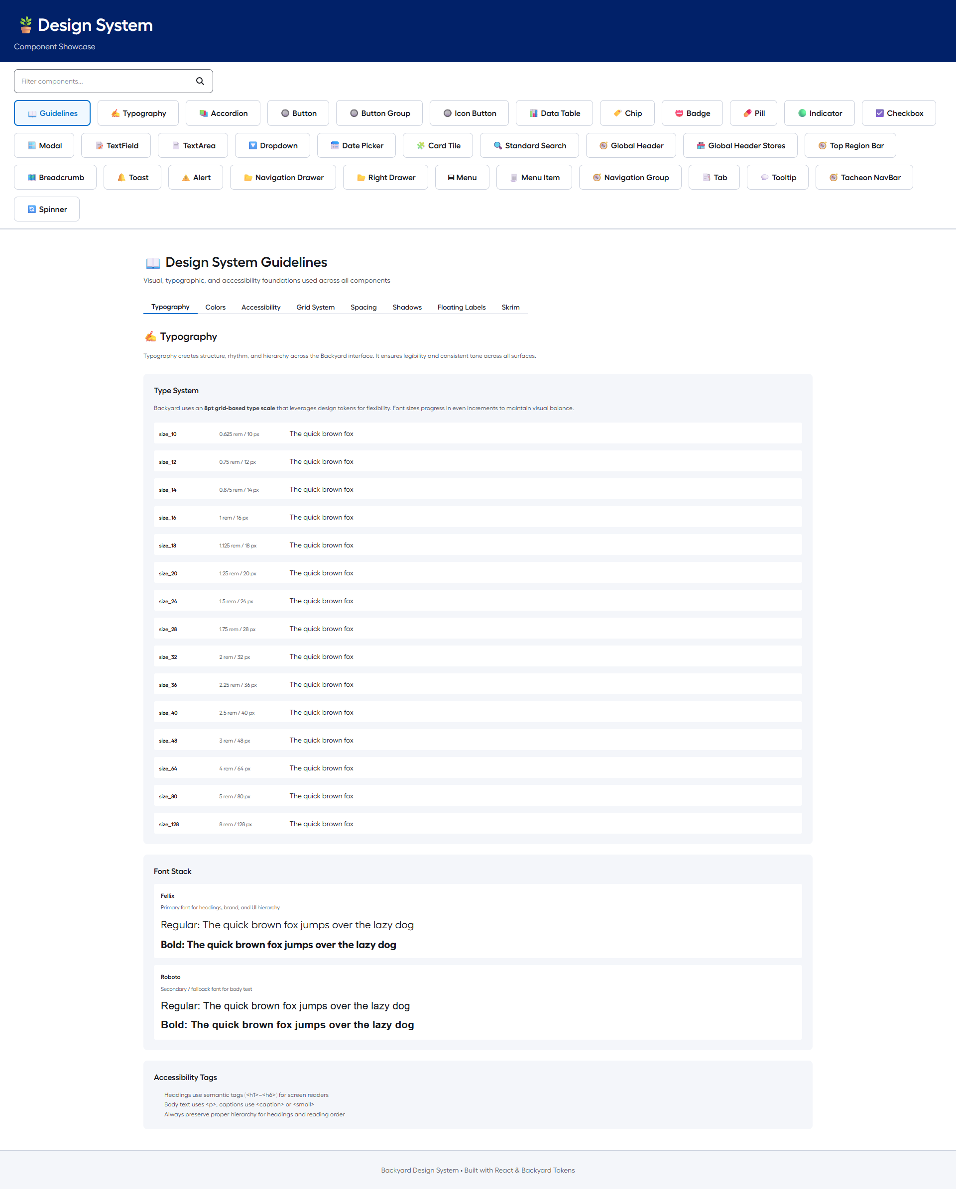
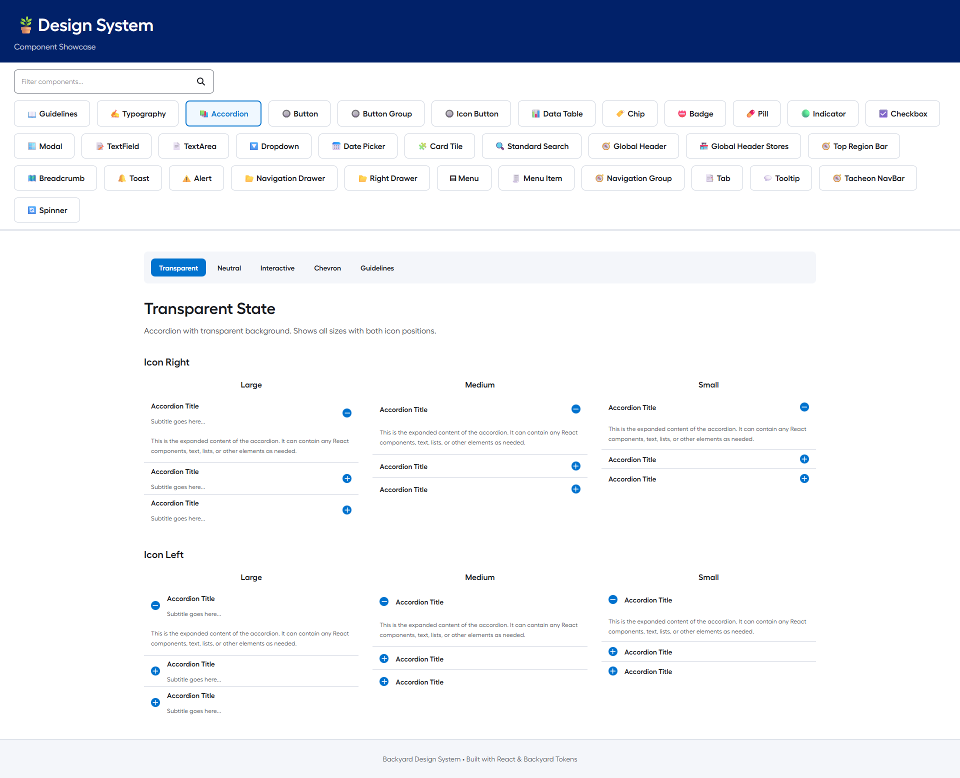
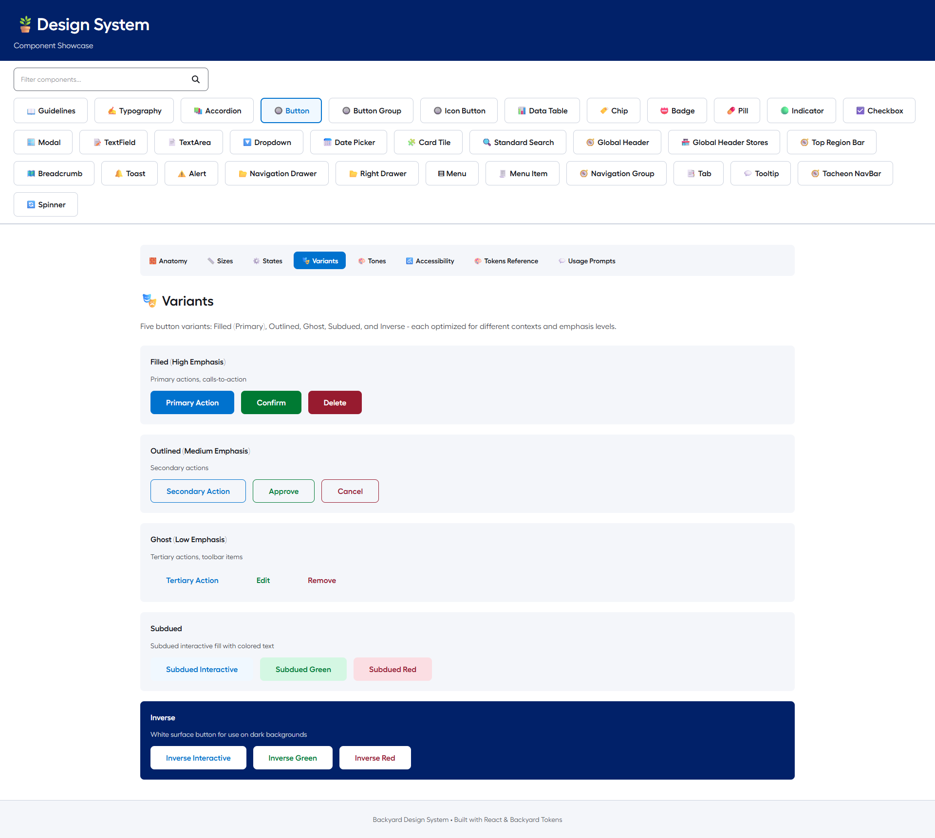
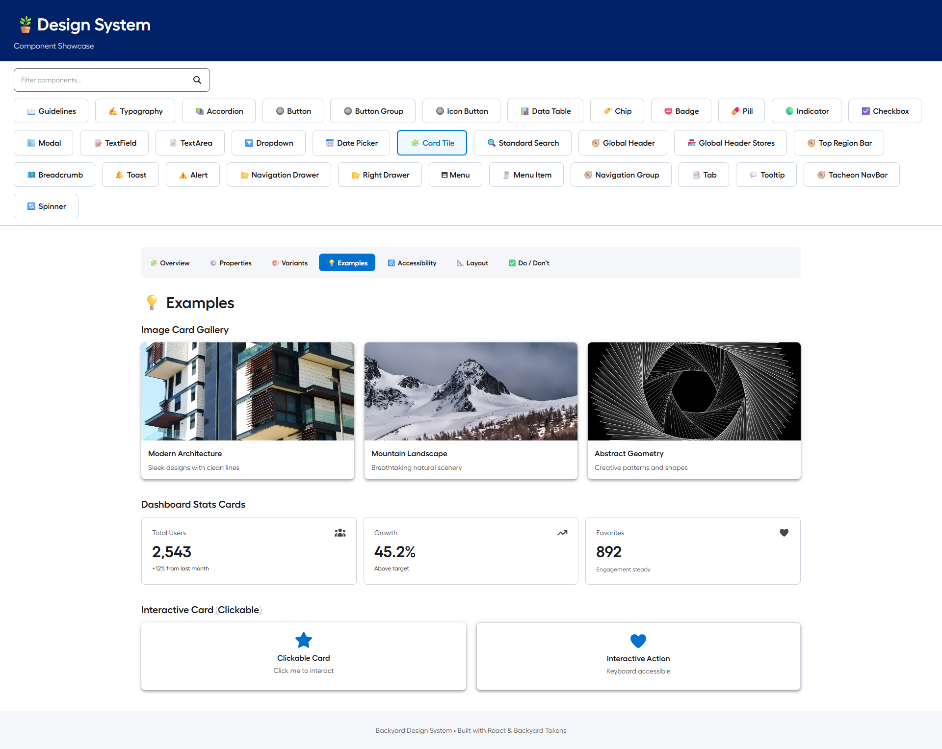
The primary objective was to architect a comprehensive showcase for the Backyard Design System. We needed to ensure that the React component library maintained exact visual parity with the foundational documentation in /guidelines/.
Visual Fidelity Gaps: Ensuring default browser styles do not override system tokens for gaps, typography, or padding.
Legacy Icon Incompatibility: Need to strictly implement FontAwesome icons, replacing incompatible sets.
Complex Layout Requirements: RightDrawer component needed to support sophisticated inline variants.
Visual Documentation
Execution & Methodology
A rigorous "Multimedia Showcase" application designed to validate visual fidelity and support future AI-assisted development workflows.
Visual Fidelity Protocol: Achieved pixel-perfect alignment with Backyard guidelines (strict 8pt grid, Fellix & Roboto typography).
Constraint Management: Standardized icon usage and style overrides (FontAwesome implementation).
AI-Readiness Initiative: Future-proofing the system for AI agents (standardized "Usage Prompts").
Milestones & Audit Strategy
| Component Audit: | Gap analysis, typography verification, padding standardization. (Phase 1) |
| Layout Refactor: | RightDrawer inline variant development, layout flow integration. (Phase 2) |
| AI Integration: | "Usage Prompts" standardization, tab integration, core component deployment. (Phase 3) |
Current Status & Next Steps
System Status: Core Components 8 (Alert, Badge, Breadcrumb, Button, etc.), Visual Fidelity 100%.
Future Readiness: AI Integration Deployed (Usage Prompts active), Accessibility WCAG AA.
Next Steps: Expand "Usage Prompts" coverage to remaining components and continue visual audit.
Future Readiness: AI Integration Deployed (Usage Prompts active), Accessibility WCAG AA.
Next Steps: Expand "Usage Prompts" coverage to remaining components and continue visual audit.
"The design system has completely changed how we build. We spend less time debating pixels and more time solving user problems."