Mooresville Customer Utility Portal - Case Study
Modernizing Public Utility Services for Enhanced User Experience
Client: Mooresville Utilities | Year: 2024 | Team: 1 person | Role: Lead Designer
Challenge: The original Mooresville customer utility portal suffered from a cluttered layout, lack of hierarchy, and inconsistent visual design, leading to user confusion and difficulty in completing basic tasks like paying bills.
Solution: Transformed the portal into a modern, user-friendly experience with a card-based layout, improved visual hierarchy, and accessible design patterns, executed solo over a two-week sprint.
Impact: Achieved a 100% usability success rate in post-redesign testing, with users reporting the interface felt "cleaner" and significantly easier to navigate.
www.arrit.portfolio/case-studies/mooresville - Cached
Problem Statement & User Pain Points
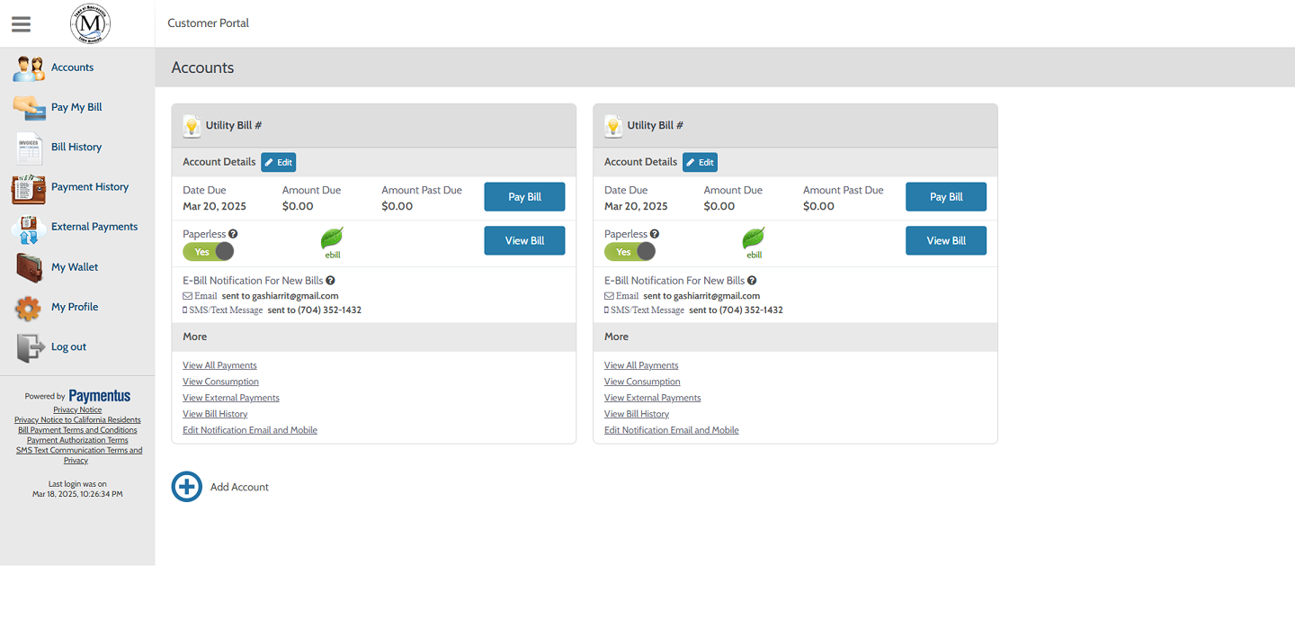
Mooresville Utilities provides essential services to thousands of residents. However, their digital portal was stuck in the past — dense with information, lacking calls-to-action, and failing to guide users effectively.
Cluttered Layout: Dense information blocks with little spacing and poor visual separation.
Lack of Hierarchy: Critical actions like "Pay Bill" blended into the background.
Inconsistent Visual Design: Mismatched fonts, buttons, and icons throughout the platform.
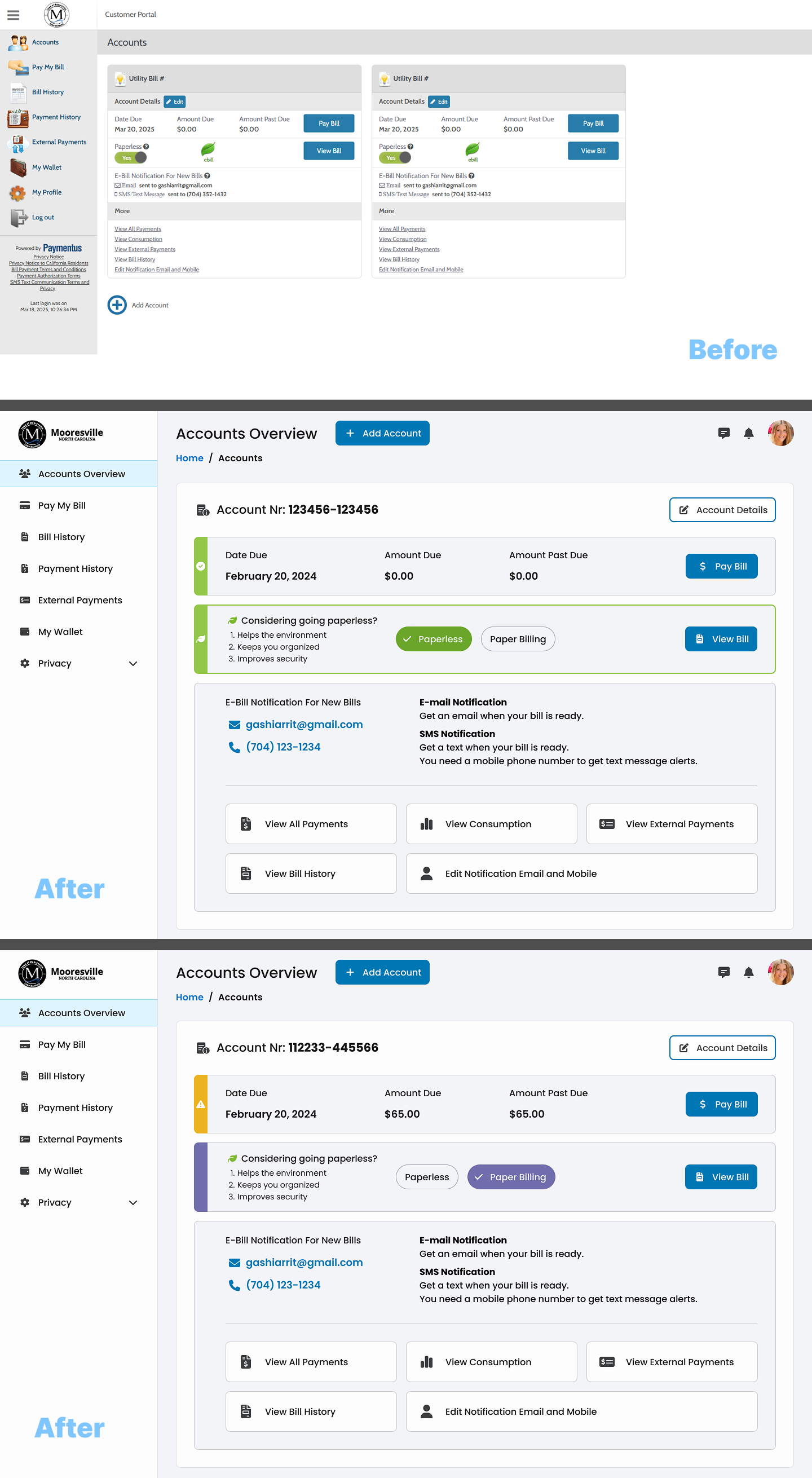
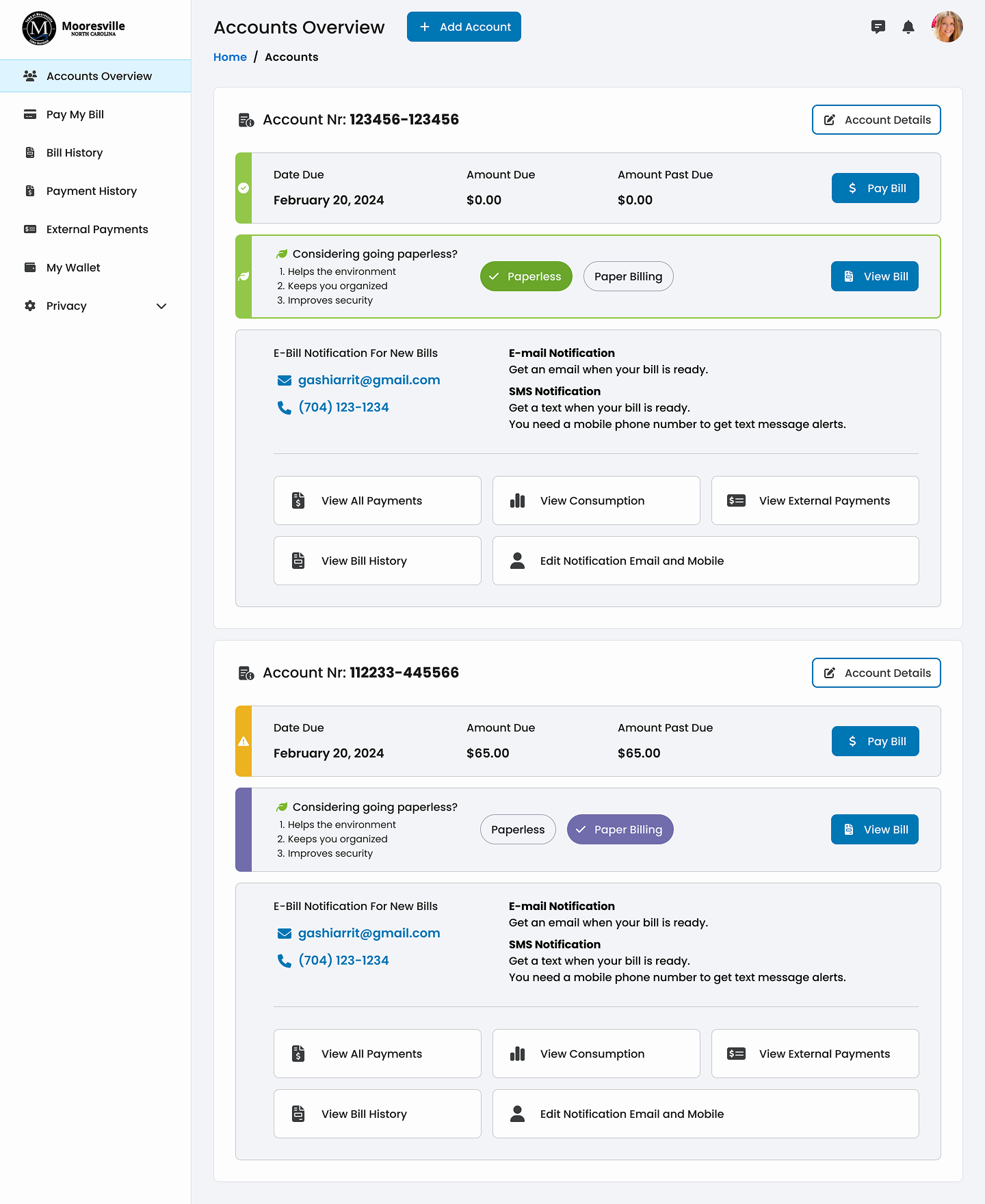
Visual Design Results
Solution Strategy & Design Approach
A comprehensive redesign focusing on clarity, efficiency, and accessibility. The new interface utilizes a modular card-based system to organize information logically.
Clean and Modular Layout: Streamlined card-based layout with generous spacing.
Improved Visual Hierarchy: Prioritized key actions and information through size and color.
Accessible Design Patterns: Consistent fonts, high contrast, WCAG compliance.
Design Process Timeline
| Research & Audit: | Heuristic evaluation, benchmarking, identifying pain points. (Days 1-3) |
| Wireframing: | Low-fidelity wireframes, IA, card-based modules, user flows. (Days 4-6) |
| High-Fidelity Design: | Pixel-perfect UI in Figma, accessible color palette, typography. (Days 7-10) |
| Usability Testing: | Conducting tests, analyzing task completion, refining. (Days 11-14) |
Results & Success Metrics
User Experience: Task Success 100%, Perceived Ease "high", fast navigation speed.
Design System: Consistency 100%, scalability ready, accessibility verified.
Design System: Consistency 100%, scalability ready, accessibility verified.
"The new design makes it so much easier to see what I owe and pay it quickly. I wish all my utility sites looked like this."